Android and iPhone App Icons
Did you put much thought into your iphone app icons? Are some of the buttons not clear? Does your app icon image get stretched out, making it look a bit unprofessional? Do all of your buttons lead to pages that provide value to your customers and readers?
Your business’s app iphone app icons is the hook that grabs people and makes them crave more from your company. It’s similar to a book title or product packaging. If it looks unprofessional, you might as well just give up now. You’re better off spending hours on your iphone app icons and leaving the rest of the content for later, because at least people will know that since your app icon is so great, there’s more to come.

Everyone can learn from different apps, so let’s take a look at some of the most creative Android and iPhone app icons and point out some of the Do’s and Don’ts to think about when designing your own app icons.
The Layout Makes People Want to Stick Around or Run Away
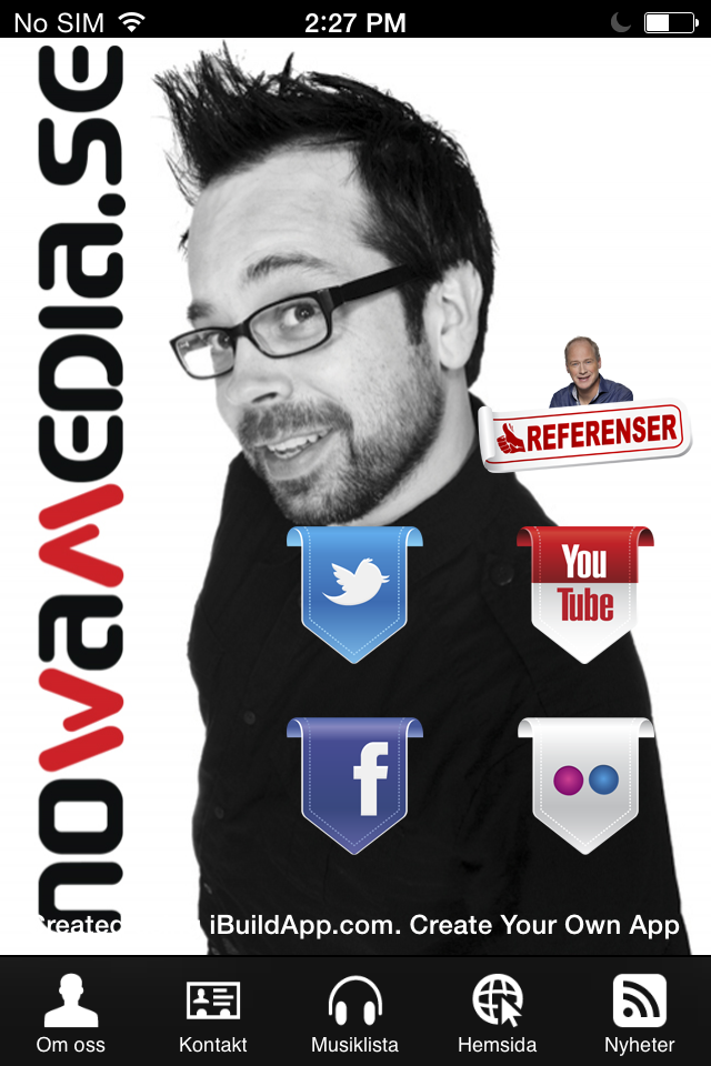
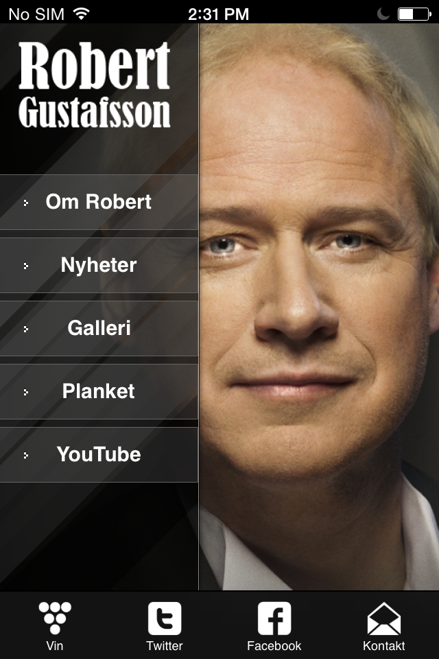

The layout includes your text, button and photo placement. It sounds simple, but you need to combine all of these components to achieve a pleasant flow.
Do: Include a handful of large buttons with minimal text and maybe one photo.
Don’t: Place buttons that cover up essential parts of an image or buttons that blend too much with an image in the background. Avoid clutter at all costs. Simpler is always better.
Big Buttons. Simple Buttons. Clear Buttons.


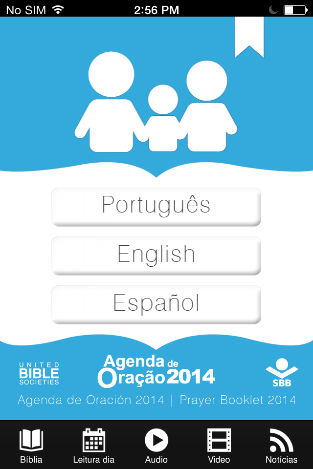
Buttons lead people to your content. If they can’t see the buttons or the buttons have cluttered text then you can’t very well assume to sell anything.
Do: Keep your call-to-actions under two or three words. When the words spill over and hurt the integrity of the buttons it looks unprofessional.
Don’t: Create small buttons or buttons that are filled with unclear, small text.
Make Sure Your Text is Visible and Not Too Cluttered
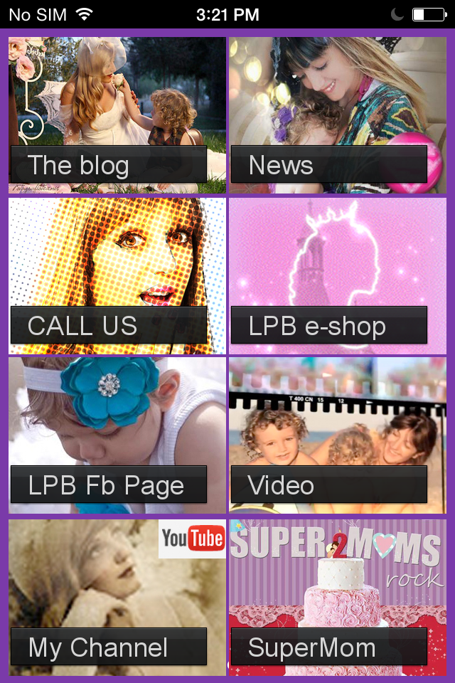

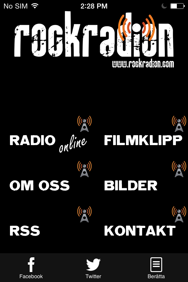
It’s exciting making an app, but don’t get too carried away. Opt for a app icons with little to no text, and spread it out so people can read it.
Do: Include logo icon and maybe one short line of text for a tagline or testimonial.
Don’t: Write a novel on your app icons. Your app includes About pages and other informational tabs to expand on your business.
Your App Icon Colors and Background Images
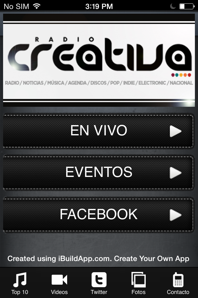
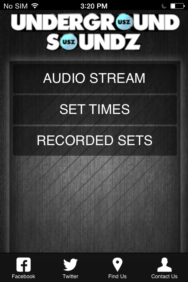
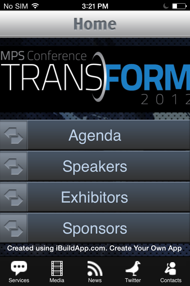
Protect your brand image with your life. This goes for when you design your app icons too. If your hot dog stand has a green logo and you make a yellow or brown mobile app then people won’t recognize your brand. Incorporate a logo and don’t just type in your company name with default text.
Do: Choose a color scheme that fits with your brand and looks pleasing to the eye.
Don’t: Clutter your iphone icon with too many colors. Avoid colors that don’t fit your brand or don’t blend with your logo.
What To Do With That Terabyte of Beautiful Photos for iPhone icons
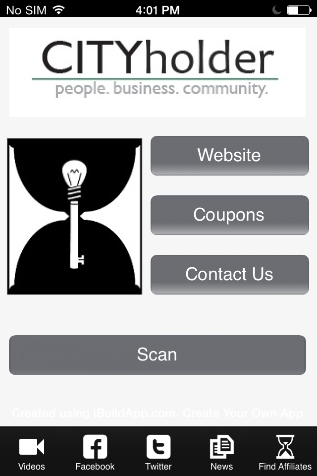
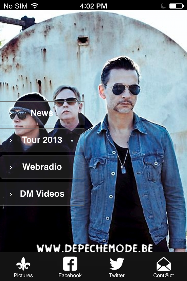
I’m sure you love taking photos of your company or organization, but a iphone icon is not the place to share them with your customers and followers. Clutter is your iphone icon worst nightmare. Use a gallery inside of your mobile app to share that collection of photos you have on your hard drive.
Do: Include one high resolution picture that displays the overall essence of your company. This image is your immediate hook to get people to view more. The most pictures you should include on your homepage is two. This is even a stretch.
Don’t: Include a low resolution photo. People will immediately delete your app if the photo looks stretched out or displeasing to the eye. Also, only include one, maybe two images on your homepage. You may have lots of great photos, but people aren’t there to worship every piece of your photography.
Let us know in the comments section if your mobile app violates any of these Don’ts on the list. Would you include any other Do’s or Don’ts that are necessary when developing a high quality iphone icon? The homepage is your chance to connect with people before they really even know what it is you offer. Come out with a bang and use these tips for the future.
